Publication author
Comments: 1160Publics: 2780Registration: 06-03-2017

Thanks for Rog for supplying us with his latest Scroller routines to look at. Attachments Beanscroller File size: 212 KB Downloads: 58 Publication author offline 2 weeks mus@shi9 0 Comments: 1160Publics: 2780Registration: 06-03-2017
Thanks for Rog for supplying us with his latest routines to look at. Attachments BeamHack2 File size: 353 KB Downloads: 40 Publication author offline 2 weeks mus@shi9 0 Comments: 1160Publics: 2780Registration: 06-03-2017

Publication author offline 2 weeks mus@shi9 0 Comments: 1160Publics: 2780Registration: 06-03-2017
Nice!
Nice Zzzax conversion of Tangerine Dream’s great tune.
nice zik yep
I remember learning to do antialiasing by hand by watching static draw a logo… this was probably around 1989. Since then i did most of the logos in my onw productions 🙂
i like the vector and the music is very funny 🙂
Yup – Streethawk theme for sure. Knightrider on 2 wheels.
Ahh vectorballs always remembers me on the RSi megademo 🙂
Nice music. Looks kind oldschool late 80s yet with 90s elements. – iN7!/Syn
very nice music.
Hmmmm I don’t know really.
Its the music from streethawk right?
Yes it was probably the O key. We had limited resources at that time.
You were hardly alone doing it at the time. It was actually quite a nice and simple way of doing it except that the corners usually looked like complete crap since you just added layer upon layer upon layer (think it was the ‘o’ key in deluxe paint).
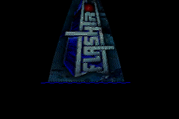
It’s true. The logo was a simple outline. I made it at age of 15 back in the days. At that time it looked good to me but I was well aware that it was a simple one.
Nice, but that font must be the most annoying one I can recall at this moment, the M and N are so similar. Then add the fact that their english does leave somethings to desire …
The logo doesn’t score high points either. It is a basic stick logo that they just padded on with an outline, add a few "stars".
Really nice chip tune thou.
nice vectorballs… For the logo I’m not so fond of it… nice little chip.
Hi there. You did it! Wow. Great