Publication author
Comments: 1160Publics: 2780Registration: 06-03-2017
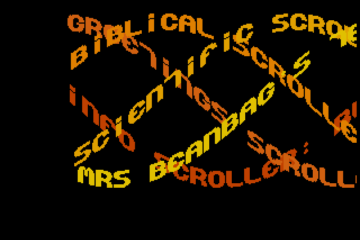
Thanks for Rog for supplying us with his latest Scroller routines to look at. Attachments Beanscroller File size: 212 KB Downloads: 58 Publication author offline 2 weeks mus@shi9 0 Comments: 1160Publics: 2780Registration: 06-03-2017
Thanks for Rog for supplying us with his latest routines to look at. Attachments BeamHack2 File size: 353 KB Downloads: 40 Publication author offline 2 weeks mus@shi9 0 Comments: 1160Publics: 2780Registration: 06-03-2017
Publication author offline 2 weeks mus@shi9 0 Comments: 1160Publics: 2780Registration: 06-03-2017
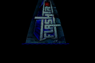
24-face cube version is always nice and convex 🙂 Good fonts and tune. Grey? Well, there are better options but “does the job” 🙂
Any credit for the tune? Remember this one but don`t remember where it was from or who did it?…
I’m digging the logo, really crisp. The font is good too, the vector is nice as well, the tune is cool. Nice typer overall.
Nice one, cool tune and great vector star! 🙂
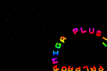
Love the intro & DDD object.. except for the color scheme 🙂 Some chill copper color thing in the logo would also be nice.. he he.
Always annoyed me that the vector isn’t centred, so some of it goes off the screen into the lower border, but the top part doesn’t…
But if you centered the vector in the middle it would mess with the fantastic logo
Nice Zenith Graytro from late 1950 😀 Great typer and vector star. Tune works perfect!
kudos for the filled vector in the background, cool typewriter effect and fine tune as well. Gray is the new blonde ;- ) Thx 4 da upload.