Publication author
Comments: 1160Publics: 2780Registration: 06-03-2017

Thanks for Rog for supplying us with his latest Scroller routines to look at. Attachments Beanscroller File size: 212 KB Downloads: 58 Publication author offline 2 weeks mus@shi9 0 Comments: 1160Publics: 2780Registration: 06-03-2017
Thanks for Rog for supplying us with his latest routines to look at. Attachments BeamHack2 File size: 353 KB Downloads: 40 Publication author offline 2 weeks mus@shi9 0 Comments: 1160Publics: 2780Registration: 06-03-2017
Publication author offline 2 weeks mus@shi9 0 Comments: 1160Publics: 2780Registration: 06-03-2017
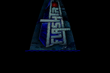
Revisiting and still shocked with the logo. The coder should have slapped a plasma-effect on that –> infinitely better end-result IMO.
Nice sine and tune. Logo could be better…
Sorry, this intro is really ugly for 1990. Now i’m blind, but the music massage my eardrums 😀
Logo is a masterclass of Dpaint smear I think, looks ugly as hell!
Oddly I never saw anything individually from Valhalla, only ever saw their co-op work with Skid Row.
I was equally surprised how many cracks they did “standalone”. They had one other (attempt at) a logo — used in multiple colors 🙂
That logo has no place in such a nice intro – the scroller + music are really good, unlike Spiv I could probably make a better logo 🙂
That logo ruins what would otherwise be a perfect classical Amiga intro. Such a shame.
One wonders if the coder actually thought it through when putting it in. And if he did, what he was thinking.
Nice sinus! Amazing RK zik.. ahh. Just the logo does not match the rest (not that I could myself pixel anything even close to it, though).