Publication author
Comments: 1160Publics: 2780Registration: 06-03-2017
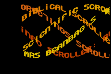
Thanks for Rog for supplying us with his latest Scroller routines to look at. Attachments Beanscroller File size: 212 KB Downloads: 58 Publication author offline 2 weeks mus@shi9 0 Comments: 1160Publics: 2780Registration: 06-03-2017
Thanks for Rog for supplying us with his latest routines to look at. Attachments BeamHack2 File size: 353 KB Downloads: 40 Publication author offline 2 weeks mus@shi9 0 Comments: 1160Publics: 2780Registration: 06-03-2017
Publication author offline 2 weeks mus@shi9 0 Comments: 1160Publics: 2780Registration: 06-03-2017
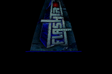
I like the font on the trainer options, but the font on the scroller is a little rough. I like the logo simply because it *is* a rip of of the Elite Systems logo. 🙂
Surely the logo is a hackjob on Elite Systems logo?
the logo and display job is great : ) the rest could be better with a diff font / colours
The logo is great, also the way it is displayed is cool
Such a great logo – such a disappointing font
I like the font! But it doesn’t really go with the logo/layout of the menu really…