Publication author
Comments: 1160Publics: 2780Registration: 06-03-2017

Thanks for Rog for supplying us with his latest Scroller routines to look at. Attachments Beanscroller File size: 212 KB Downloads: 58 Publication author offline 2 weeks mus@shi9 0 Comments: 1160Publics: 2780Registration: 06-03-2017
Thanks for Rog for supplying us with his latest routines to look at. Attachments BeamHack2 File size: 353 KB Downloads: 40 Publication author offline 2 weeks mus@shi9 0 Comments: 1160Publics: 2780Registration: 06-03-2017
Publication author offline 2 weeks mus@shi9 0 Comments: 1160Publics: 2780Registration: 06-03-2017
Different and fresh and even I hate hiphop stuff – this intro r0x for me!
I’m a little meh about this one. At first it feels fresh, but at then same time, if feels like a Melon Design intro and thats not always a compliment.
Heh.. a nice one. I am typically on the old-fart department when it comes to crack intro design but this has a nice vibe 😀
fresh colour combination, cosy atmosphere
Really nIce design, good sample based tune.
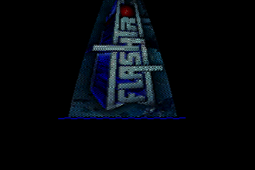
Great logo too but short lived! 🙂
Nice bg effect with the circles/lines, very effective-looking but simple 🙂
Quite avantgarde.
Who remembers Little Fluffy Clouds?
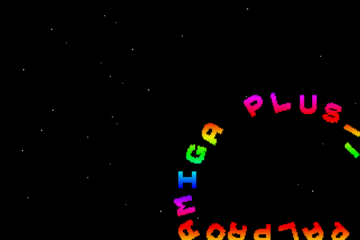
coherent design, but that cool logo should appear more than just once.
Interesting. It would, IMO got more in style and design if the text were in white, or similar. Great effect under the wave. Original!
Asano Miho (“浅野美穂”)? 😉