Publication author
Comments: 1160Publics: 2780Registration: 06-03-2017
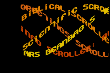
Thanks for Rog for supplying us with his latest Scroller routines to look at. Attachments Beanscroller File size: 212 KB Downloads: 58 Publication author offline 2 weeks mus@shi9 0 Comments: 1160Publics: 2780Registration: 06-03-2017
Thanks for Rog for supplying us with his latest routines to look at. Attachments BeamHack2 File size: 353 KB Downloads: 40 Publication author offline 2 weeks mus@shi9 0 Comments: 1160Publics: 2780Registration: 06-03-2017
Publication author offline 2 weeks mus@shi9 0 Comments: 1160Publics: 2780Registration: 06-03-2017
Very nicely designed and implemented! Great logo, a bit more color would give it a bit more life but the shape is so nice. Another cool prod, congratz Guyz!
Great intro, really like the tune.
Thx @ All ! 😀
Nice cracktro again, T.I.M. Fits perfect. Like the Mordred-Logo, the small Charset and the TDK Tune. Thx for the Greeting, too!
everything fits … big thx guyz!!
Wonderful cracktro!
Like always – this is quality work. Maybe the zooming squares are moving a bit too fast, but when i run it in full screen mode, it’s not that big of a deal. I really appreciate the thought of having my nick in there with all those great people – thanks for that!
Nice design! The logo is really slick. Was it drawn by hand?
I also love the squares on both sides, that was a really nice touch.
Greetings to our friends in Redrum <3
Thank you! The logo was drawn in Photoshop with a trackpad. ?
Not bad, not bad at all! I’ve been considering using Photoshop as well, especially the Adobe “Imageready” for its really good color conversion / remaping capabilities.
Thank you again! 🙂 Yup i like photoshop, but i use it like deluxe paint,not like a photo-editing tool, 🙂 but great tool! Glad you like my work! Tim is really good with the design and colours, and i try to make a logo that will fit with his coloursceme. Then i email my scetch and we take it from there. 🙂
YES! A greet ! Thanks T.I.M . Perfect little intro , happy vibes all works well here !
3P: Pure Passion & Pleasure
Yeah really nicely done, cool typeface and tune!! Respect!!!
the typewriter effect is ace, nice little tune and logo too. Only the background flashes a little bit too fast for me. Age sure does take its toll. And thx for the handshake … always appreciated.
What he said! The bg tiles are too fast, otherwise everything fits well 😛
Nice little intro, somehow a mixture of Interpol and Prodigy Cracktros (charset). I dont like the color scheme here but after my last codercolor trainer I am perhaps not allowed to criticize colors anymore. 🙂 Thanks for the greet!