
Attachments

Publication author
Comments: 1160Publics: 2780Registration: 06-03-2017
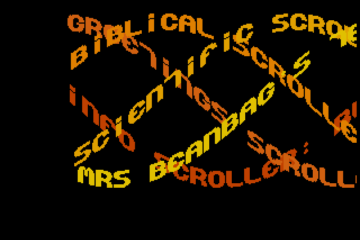
Thanks for Rog for supplying us with his latest Scroller routines to look at. Attachments Beanscroller File size: 212 KB Downloads: 58 Publication author offline 2 weeks mus@shi9 0 Comments: 1160Publics: 2780Registration: 06-03-2017
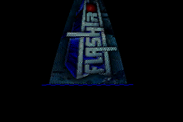
Thanks for Rog for supplying us with his latest routines to look at. Attachments BeamHack2 File size: 353 KB Downloads: 40 Publication author offline 2 weeks mus@shi9 0 Comments: 1160Publics: 2780Registration: 06-03-2017
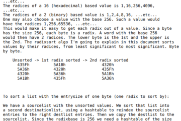
A special thanks to ROG for this commented source code.. More to come Download the source files below Attachments Radix_Theory File size: 36 KB Downloads: 152 Publication author offline 2 weeks mus@shi9 0 Comments: 1160Publics: Read more…
Well one positive aspect of its simplicity is that it’s easier to learn from. Start with the basics — logo, text, and a starfield. Then move on to more creative design and code.
this one is pretty simple and was mainly done to try and have the possibility to have room for more trainer options without having them split over several pages.
The font used is kept small for that reason and it is proportionally spaced (daniello used to drive me crazy with his proportionally spaced fonts as it makes it a bit of a pain to draw in tile mode!!)
I like the logo and simple can sometimes be beautiful.