Publication author
Comments: 48Publics: 27Registration: 10-01-2012
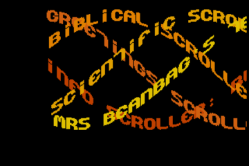
Thanks for Rog for supplying us with his latest Scroller routines to look at. Attachments Beanscroller File size: 212 KB Downloads: 58 Publication author offline 2 weeks mus@shi9 0 Comments: 1160Publics: 2780Registration: 06-03-2017
Thanks for Rog for supplying us with his latest routines to look at. Attachments BeamHack2 File size: 353 KB Downloads: 40 Publication author offline 2 weeks mus@shi9 0 Comments: 1160Publics: 2780Registration: 06-03-2017
Publication author offline 2 weeks mus@shi9 0 Comments: 1160Publics: 2780Registration: 06-03-2017
Really like the music, the skills of the musician make it sound almost 4 channel. Like the logo swing, and different from the norm, the flashing scrollers and such dont do much for me, seemed to be a thing on the c64
its far from the best c64 intro, the music is good, the scroller font is crisp but the logo swings a little too fast. still nice to see another C-64 conversion… keep them up 🙂
Perhaps the gfx artist did want “P” to look as similar as possible as “R”, esp. given the fact that they are both positioned next to the same letter (“A”). As most of logos were converted from bitmap to char/screen combo (including this one), that would save them some space. And since the font for scroller is crammed into the same char space ($0800-$0fff), you are pretty limited with what you can use both for screen and char to show a (“overscan”) logo as big as “Paramount”.
One of the best intros on the C=64, bar none and my personal favorite, slapped on one of the best games ever made for that system. Minimal but elegant!
The artist on that logo made a weird choice to distance the ‘P’ so far from the rest of the letters? Nice tune!
I don’t think it was an artistic decision 😛 Remember the c64 is 8×8 tiles, so to re-use the same tiles (mostly) for “P” and “R” it was done this way, it just looks weird because the “P” is next to an “A” which slopes away from it and creates the gap you noticed.
Fixed in my version of the logo: http://csdb.dk/release/?id=53401
…by “tiling” you’re no doubt referring to 160x200x3 “screen+charset” technique, but from personal experience I can tell you that it didn’t have to be tiled.
It didn’t have to be, but it was 😛 Just checked it out in VICE and it’s MC char mode (160×200, 3cols) as you said. You can’t be wasting space making a nice “P” when you’re trying to squeeze the intro and a game in memory at the same time 🙂
Even three color logos like that weren’t drawn on a grid or tiled, as they were usually drawn in Art Studio, and then converted with one of many conversion programs, which would then generate the “charset” (font), and then build the “screen” out of it.
I personally used Advanced Art Studio 1.6+, and a logo converter, never a font maker for this, I could imagine others used Koala and Amica Paint as well.
We learn every day! … Didn’t realize it was a ‘technical limitation’
It’s not a technical limitation, the logo was simply drawn as a monospaced word. I could see no reason for this, so I redrew it as proportional. I think it was nothing more than an oversight on the part of the author, or perhaps the away sloping A makes it more pronounced.
You can’t really compare logos of two different sizes. The real test would be to redraw the whole logo as proportional, then convert it to char+screen and see if you can fit it with scroll font into same 2k memory space.
Without any similarities between tiles (8×8 blocks), for logo as big as 382×54 pixels, that would already be impossible as it would require about 336 (48×7) tiles, which is a bit more than 256…
Well well, look what the cat dragged in! Hello mayor, so you’re still alive? I believe there is enough similarity in the patterns of the logo to be redrawn proportionally and still fit; the problem is, as far as I remember it, that Art Studio can’t draw wider than 160 pixels, and I’m not even sure which drawing program could. This logo, being wider than 160 pixels, would need additional “massaging” by the coder, moreso since the VIC chip has no concept of modulo, like Amiga CustomChips do… how do you propose it be done, with which tools? And which… Read more »
I guess you’d draw the logo in 2 “lines”, splitting it at 8pixel boundary and after you’d convert it to screen+char, you’d re-attach “screen” into one line (coder’s work). I don’t remember the tools for converting it, but you could use Adv. Art Studio or any other multicolor bitmap capable tool for drawing it.
P.S. I wasn’t suggesting YOU should do it personally.
the tiling on c64 didn’t work tat way, or at least it didn’t have to. I just think he copped the letters from a font, and did not bother with the kerning.
I know of no font on the Commodore 64 in that style, I believe the logo is unique.
Yep, a new C64 conversion is always nice (<3 SID). Thanks Tstorm, good job!
Both replayers sound very similar to me, but the WebSID has about a 2 second delay before the music begins to play here…
Average C64 intro, the classic logo-swing is present (as always) but slightly better with the vertical movement too.
New c64 is always appreciated. Average intro with a fine tune. Nice.