Publication author
Comments: 1160Publics: 2780Registration: 06-03-2017
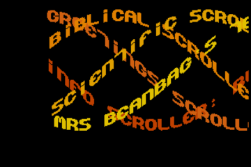
Thanks for Rog for supplying us with his latest Scroller routines to look at. Attachments Beanscroller File size: 212 KB Downloads: 58 Publication author offline 2 weeks mus@shi9 0 Comments: 1160Publics: 2780Registration: 06-03-2017
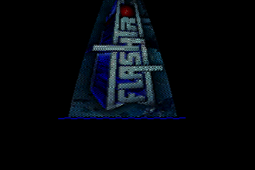
Thanks for Rog for supplying us with his latest routines to look at. Attachments BeamHack2 File size: 353 KB Downloads: 40 Publication author offline 2 weeks mus@shi9 0 Comments: 1160Publics: 2780Registration: 06-03-2017
Publication author offline 2 weeks mus@shi9 0 Comments: 1160Publics: 2780Registration: 06-03-2017
“i like the mad tro better, in my opinion this font isn’t stylish and the logoscroll doesn’t dit to the cool writer routine. maybe i don’t like this one”
Yep! This is a textbook example of how bad design choices can ruin really nice intro routines.
Had this intro had better graphics, it would have been a masterpiece with that text writer routine, which was pretty revolutionary for its day. It ushered a new era of complex and fancy 3D text typer routines which are so prolific on the PC scene even today.
black hawk and badboy of trilogy and later paradox and many other groups were some of the most prolific danish crackers ever. Only perhaps ibm of oracle could compete.
i like the mad tro better, in my opinion this font isn’t stylish and the logoscroll doesn’t dit to the cool writer routine. maybe i don’t like this one, b’coz i never saw it back in the days
…
I was always asking myself what would have been with Paradox without the Black Hawk … This guy was never perceived as one of the most skilled crackers as far as I know but damnit his productivity in the early 90s was definately impressive to say the least …
lovely tune!! and the sprites are fitting cool aswell..the fonts are better too as in the m.a.d. version!