HTML5tro
Rog Source Code – Bean Scroller
Thanks for Rog for supplying us with his latest Scroller routines to look at. Attachments Beanscroller File size: 212 KB Downloads: 58 Publication author offline 2 weeks mus@shi9 0 Comments: 1160Publics: 2780Registration: 06-03-2017


Sierpiński’s dots to “draw” the logo – awesone (the logo itself is ok). Pre-calced pos dots on the ball rulez too. Cool msx. Still, it all looks separated… Maybe some nicer color scheme would “connect” it better. Still – good stuff!
Hm… not sure. The design und music is very nice, but the slow starting logo and the logo design is not my cup of tea. Would perfect for me with another logo.
Tune glitches a lot here, but nice code by Spook.
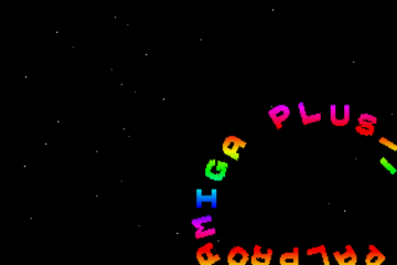
Nice tune, cool logo and “text wrap on ball” effect. Maybe a starfield would have helped with the big black thing around it. 😉
The animation at the beginning is to slow for my taste. 😛
You can skip it by pressing the LMB.
The building-up of the logo with flying Sierpinksi fractals is nice; but the painted logo itself is not my cup of tea.
Moreover, I like the text sphere. Maybe its bouncing across the screen would have been good for the dynamics and to fill the black void.
But all in all a (technically) very nice and creative cracktro.
Classic chip by morph, awesome logo (and build) and nice & original typer..
This is what a cool intro looks and sounds like; a study in good design could be made out of it.
nice tune by morph, gr8 idea for the logo by quartz, cool ball effect in the middle too, maybe a bit too much black around the ball? Kick off 2 … man, what a game!