Publication author
Comments: 1160Publics: 2780Registration: 06-03-2017

Thanks for Rog for supplying us with his latest Scroller routines to look at. Attachments Beanscroller File size: 212 KB Downloads: 58 Publication author offline 2 weeks mus@shi9 0 Comments: 1160Publics: 2780Registration: 06-03-2017
Thanks for Rog for supplying us with his latest routines to look at. Attachments BeamHack2 File size: 353 KB Downloads: 40 Publication author offline 2 weeks mus@shi9 0 Comments: 1160Publics: 2780Registration: 06-03-2017
Publication author offline 2 weeks mus@shi9 0 Comments: 1160Publics: 2780Registration: 06-03-2017
SID style mode rules.
that should say MOD obvs 😉
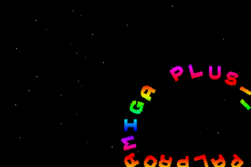
Tune & scroller + starfield = r0x!
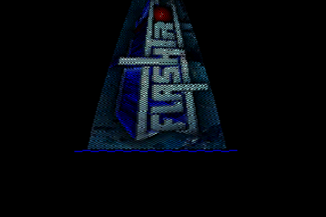
Oh I don’t know… that logo does it for me 🙂
nice prod, but could have been way better: great tune, logo is substandard for 1991 and the color of the sine scroller is just wrong.
Never heard of these guys in Belgium… Nice intro though.
i´d say the gray shadow on the font should be only 1 line above the font, this feels like i´m seeing double. 1 pix diagonal shadow would look better, methinks. Other than that, nice intro.
Very nice LSD intro, they had a few. I like the smooth sine scroller and the tune is an all-time classic. Nice stuff.