Publication author
Comments: 1160Publics: 2780Registration: 06-03-2017

Thanks for Rog for supplying us with his latest Scroller routines to look at. Attachments Beanscroller File size: 212 KB Downloads: 58 Publication author offline 2 weeks mus@shi9 0 Comments: 1160Publics: 2780Registration: 06-03-2017
Thanks for Rog for supplying us with his latest routines to look at. Attachments BeamHack2 File size: 353 KB Downloads: 40 Publication author offline 2 weeks mus@shi9 0 Comments: 1160Publics: 2780Registration: 06-03-2017
Publication author offline 2 weeks mus@shi9 0 Comments: 1160Publics: 2780Registration: 06-03-2017
Nice! I love the dots and VF-like Copper bars!
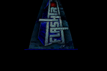
Wow, this is a cool intro … would be a 10 with another logo. But the rest is great!
Dots, twisty copper and tune – so nice.
Very nice one. Cool, really, tune, good math under the typer, tastefull copper. The logo is not tooooo much my cup, but I can swollow it even if cold… Great one!
I quite like it, simple but effective. Music is nice as well.
I think there is a bug in the interpretation of the writer though, every time a letter is plotted behind the blue square, a pixel of the letter appears to the right of the square.
Good eyes for and old man 😛
Fixed
always like the typewriter effect … end of line
That logo makes my eyes angry, but everything else is pretty sweet.
Not bad at all! Beautiful dot patterns. The zik has some good parts in it and with a small mods here & there it would be superb.
It’s not bad, but it doesn’t exactly stand out 😛 Didn’t Gothic have a really good gfx-artist (DSign or something?) – looks like he wasn’t in the group at this point when you look at this logo 🙂