Publication author
Comments: 1160Publics: 2780Registration: 06-03-2017

Thanks for Rog for supplying us with his latest Scroller routines to look at. Attachments Beanscroller File size: 212 KB Downloads: 58 Publication author offline 2 weeks mus@shi9 0 Comments: 1160Publics: 2780Registration: 06-03-2017
Thanks for Rog for supplying us with his latest routines to look at. Attachments BeamHack2 File size: 353 KB Downloads: 40 Publication author offline 2 weeks mus@shi9 0 Comments: 1160Publics: 2780Registration: 06-03-2017
Publication author offline 2 weeks mus@shi9 0 Comments: 1160Publics: 2780Registration: 06-03-2017
I like the interesting writer.
Holy crap does that look shitty. Made by a nine year old at the time, or what? Extra penalty points for no music!
Some points for not looking the same as most other Amiga intros, but on the other hand it’s not that good! 😛
Yeah, interesting design but for some reasons, I find it “strange”.
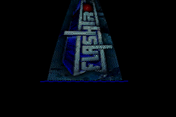
nice logo design
Logo has potential but for the lack of color. Give it 32 colors or 64 colors extra half-brite and one could have had a killer logo.
I suspect the logo had more colours but it was stripped right down to 2, so it could fit on the disk which only had a very small amount of free space for the cracktro