Publication author
Comments: 1160Publics: 2780Registration: 06-03-2017
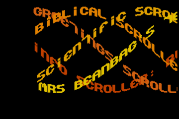
Thanks for Rog for supplying us with his latest Scroller routines to look at. Attachments Beanscroller File size: 212 KB Downloads: 58 Publication author offline 2 weeks mus@shi9 0 Comments: 1160Publics: 2780Registration: 06-03-2017
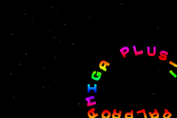
Thanks for Rog for supplying us with his latest routines to look at. Attachments BeamHack2 File size: 353 KB Downloads: 40 Publication author offline 2 weeks mus@shi9 0 Comments: 1160Publics: 2780Registration: 06-03-2017
Publication author offline 2 weeks mus@shi9 0 Comments: 1160Publics: 2780Registration: 06-03-2017
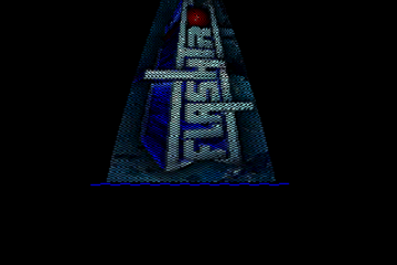
The logo is only thing done right.
OK logo and like the scroll fonts… however the scroll should go below the logo gfx and not be cut like it is now 😉
Well for 1990 this is a pretty ugly trainermenu, but there is something OK about the logo at least!
Truly grassroots stuff…
The logo reminds me of Metallica’s logo.
well, not much to see in this one. The logo is quite okay and provides certain depth to the rather lifeless screen. For a first release its okay I guess. The color selection of the (dpaint) fonts is atrocious.