Publication author
Comments: 1160Publics: 2780Registration: 06-03-2017

Thanks for Rog for supplying us with his latest Scroller routines to look at. Attachments Beanscroller File size: 212 KB Downloads: 58 Publication author offline 2 weeks mus@shi9 0 Comments: 1160Publics: 2780Registration: 06-03-2017
Thanks for Rog for supplying us with his latest routines to look at. Attachments BeamHack2 File size: 353 KB Downloads: 40 Publication author offline 2 weeks mus@shi9 0 Comments: 1160Publics: 2780Registration: 06-03-2017
Publication author offline 2 weeks mus@shi9 0 Comments: 1160Publics: 2780Registration: 06-03-2017
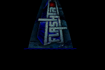
Nice effect! Really. Nice fonts. But not my cup. The logo is quite fugly =/… And perhaps because the music is (imo) TRSI-only (intro by felon).
Interesting concept put into work a nice way.
The font with the shadows is awesome. High resolution, by the looks of it? The logo is utter shit. The music is meh. No scroller, so it’s a typer.
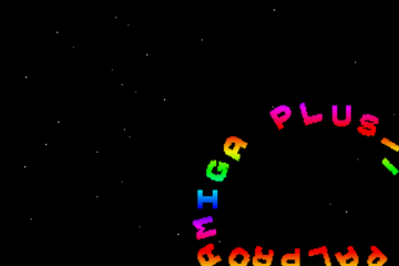
The colors look strange, and the rotating objects should stay more time on screen imho. 🙂
yeah, i do like the objects in this 1993 intro and the tune as well.