Publication author
Comments: 1163Publics: 2787Registration: 06-03-2017
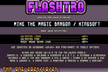
Download game below Attachments MikeTrainer File size: 544 KB Downloads: 12 Publication author offline 2 days mus@shi9 0 Comments: 1163Publics: 2787Registration: 06-03-2017
Publication author offline 2 days mus@shi9 0 Comments: 1163Publics: 2787Registration: 06-03-2017
Publication author offline 2 days mus@shi9 0 Comments: 1163Publics: 2787Registration: 06-03-2017
Nice little intro. Simple, elegant. What more could one possibly want or need?
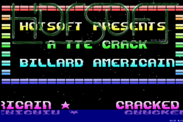
Nice starfield and sinus scroller, the tune is very good too! 🙂
The font is weird and cool at the same time! 😛
Heh, not the greatest choice of colors in this intro but I can very much relate coder’s choices, though. Great zik by Fred Hahn (from game Ilyad).
kudos for the tune, even if the bassline kicks in a bit late.
This is cool, like the typeface especially in the scoll
For some reason I really dislike the letter D in this font, otherwise I agree with you 😛
Agree with you, I understand the artist want a curve on left top in general but then R has not got that treatment even though it would fit better on R than the D
Well spotted! And the R looks much better in its current shape. The font’s design is incongruent. I don’t like inconsistencies.
I can see why you dislike it: the D glyph is imprecise (needs surrounding letters and then the entire word to recognize it). The cognitive load on that letter is high and especially so because it reminds of Q. I’m pretty sure that cognitive load wasn’t anywhere on the radar of the guy who drew the font.