Publication author
Comments: 1163Publics: 2786Registration: 06-03-2017
Publication author offline 3 days mus@shi9 0 Comments: 1163Publics: 2786Registration: 06-03-2017
Publication author offline 3 days mus@shi9 0 Comments: 1163Publics: 2786Registration: 06-03-2017
Publication author offline 3 days mus@shi9 0 Comments: 1163Publics: 2786Registration: 06-03-2017
Mark II tunes are always awesome. I quite like the font and copper clash; it’s an interesting contrast.
Very Amiga style to me… Remids Corsair’s works.
I like the tune
Mark II checked, beloved copper effect checked, good font checked and smooth yet simple presentation. Approved 😉
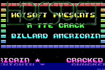
I have the impression this copper effect can be seen in many other prods with exactly the same colors (yellow, red, purple, light blue…) while there could be many so many alternatives. Was it an easy way to do it (lazyness to write colors table ?) or is there some technical reason ?
Lazyness and/or coder doing color design..
yeah hard to read scroller due to the gold font, made harder by the bounce but at least he apologized in the scroller 🙂
Conqueror & Zike, two of my favorite intro coders, and they never disappoint. They are from Sweden, right?
real cool tune, by mark II used by LightFORCE too.
I really don’t like that gold font on top of the copper background, but I can’t hate on a C+Z intro even if it’s just an old import intro 🙂