Publication author
Comments: 1163Publics: 2786Registration: 06-03-2017
Publication author offline 1 hour mus@shi9 0 Comments: 1163Publics: 2786Registration: 06-03-2017
Publication author offline 1 hour mus@shi9 0 Comments: 1163Publics: 2786Registration: 06-03-2017
Publication author offline 1 hour mus@shi9 0 Comments: 1163Publics: 2786Registration: 06-03-2017
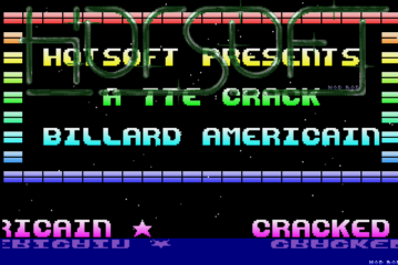
The upper logo design is so horrible that the logo is unreadable. Good job making it unrecognizable!
“Crisp? That’s that thing to eat?”
“No moron, it’s a study in how to make an identity easily recognizable and memorable.”
The vectors and tune are really nice here, not sure about the colors but they make this intro easy to remember 🙂
Nice logo and tune, was this the Freestyle from TIC/Freestyle coop?
Greetings to Liberator 🙂
nice one, kudos for the font in the second scroller and with the right colors this logo could be pretty cool.
The colors look too washed out.
Like what mr.spiv already said, the transition between the vector objects is cool. 🙂
Not a bad intro at all. The logo genre is not my cup on coffee. The morph thingy when changing 3D objects is ace.