Publication author
Comments: 1163Publics: 2786Registration: 06-03-2017
Publication author offline 5 days mus@shi9 0 Comments: 1163Publics: 2786Registration: 06-03-2017
Publication author offline 5 days mus@shi9 0 Comments: 1163Publics: 2786Registration: 06-03-2017
Publication author offline 5 days mus@shi9 0 Comments: 1163Publics: 2786Registration: 06-03-2017
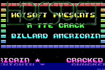
I like this one! Cool logo, excellent music and lots of colours 🙂
i like the colourful rasters in the lower part. And the Logo is nice too!
Seems like they wanted do put 2 cractros in 1 and they succeded 🙂 And both are nice but separated would look even better.
That’s probably the most accurate description 🙂
ouch! As others have rightly said, technically nice but an almighty mess. I remember from back in the day that they had a member called Crap… strange how some things lodge in the mind…
A lot to see here but way to much for my old eyes:-) I always give up up on double or more sine scrollers.
Tune is pretty nice.
It just doesn’t fit together well, although I like most of the individual elements here (especially the vertical copper stuff behind the text at the bottom).
That’s a lot going on here!!! :-p
Nice tune and logo!!!
thx 4 da upload, trsi-like logo and nice tune. always liked that font in the scroller.
On a bit messy side but /me likes anyways!! Nice scrollers and bars… No greets to me, though.. tsk tsk.