Publication author
Comments: 1158Publics: 2768Registration: 06-03-2017
Publication author offline 8 hours mus@shi9 0 Comments: 1158Publics: 2768Registration: 06-03-2017
Publication author offline 8 hours mus@shi9 0 Comments: 1158Publics: 2768Registration: 06-03-2017
Publication author offline 8 hours mus@shi9 0 Comments: 1158Publics: 2768Registration: 06-03-2017
Solid! Good logo, tune and design… Well done guyz.
Updated from flash to HTML5.
updated
/me likes
cool cool…
– great logo
– nice cooler
– del?xe font
– cool tune
like it! :satisfied
Indeed.. no scroller :plain
I rather like the intro, the gfx are kewl, the sound is average… standard complaint of mine: no scroller, dammit! 🙂
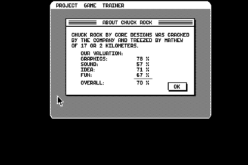
especially for YOU guys we STILL use them in our Hoodlum/Deviance Trainermenus and we will do forever Muuhahahahahahahah… -.-
real pleasant text effect in a good cracktro, great logo … and ugly sprites :-p
haha, same old arrogant siriax… what is nasty about me saying the credits sprites are ugly? this is just my opinion and i didn’t force anyone to share it. but well, you are master siriax, so this is for you: the credits sprites are the best i have ever seen, no one can make better ones since they were made by the mighty siriax! feeling better now? hope so…
lol
we used the sprites often because they look great, same with the font (taste differs, heard about that?)if you rather want me to be as nasty as you talk about the work of others I would say "if you really want to see something goddamn ugly, have a look into the mirror^^"
The logo rocks, intro is not bad but the credits sprites are so goddamn ugly, I can’t believe it. And they used them again and again just like the 8×8 font…
Used very often in 95/96. With a few changes.
almost classic, but +1 for logo 😉
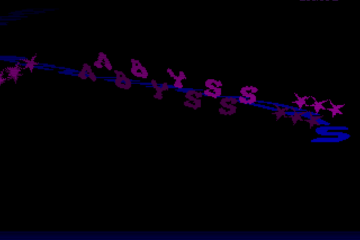
dl! stands for deathlord. nice logo from him.
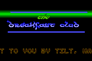
Very basic but stylish. Logo is very nice.
Quite a nice intro, good logo too… seems a waste of such a logo, to make it for Prodigy (sorry, couldn’t resist).
Nice one, especially the text writer. Not that challenging effects but nice package so to speak. Never seen this before (as it was after my active times).